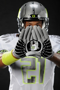
Another Bowl game brings another new look for the Oregon Ducks, who’ve worn a variation on the Nike Pro Combat 2010 Uniform every game this season. Nike’s American Football summit took place in Dallas yesterday and the company launched the updated Pro Combat System of Dress for the 2011 season and seemingly lucked out with the Ducks BCS Championship game against Heisman winner Cam Newton and the Auburn Tigers. There is no grander stage for Nike to showcase their newest duds for next season and get jersey geeks salivating. The Ducks will wear the new advanced garments for the big game, along with the Florida Gators and the Boise State Broncos, respectively.
The most surprising part about the Ducks’ 2011 uniforms are not all the technological design updates like the further streamlining of the already fitted jerseys, the new Air Zoom Alpha Talon Cleat and the use of Nike’s patent Flywire technology in a sports performance garment. But rather, compared to what Nike has produced for Oregon in the past, the BCS Championship uniform is rather underwhelming. From head to toe, the entire ensemble is a riff on what the Ducks have worn all season and sticks to the same colour palette. The jersey is mainly white with grey, black, neon and silver accents. The Duck wings are back again, this time in gun-metal grey on the shoulders. The thin Oregon font in grey on the chest and arm sleeves and is highlighted, naturally, in neon. The result is minimal, futuristic but also incredibly bright. Thank goodness Glendale is a closed dome stadium as natural light would make the game unwatchable – the Boise State Broncos in blue wearing on the smurf turf would be easier to watch.
The biggest complaint from Oregon aficionados is that the Ducks stray too far from their traditional team colour palette of green and yellow. I believe that team colours must feature on the main body of the jersey and pants and the accessories should use the alternate colours to highlight the overall look. The accessories are by the far the best part of the kit and most interesting. The gloves use two shades of silver to form a diamond pattern while black duck wings and an Oregon O display when the wearer puts up their hands to form the “O” and look very sleek. The carbon fibre helmet mimics the gloves with the diamond pattern and the “O” is in the now trademark neon. It’s a striking helmet, however I do miss the traditional mallard helmet that the Ducks wore earlier this season, which is a classic in sports design that fuses technology, design and references the duck perfectly.
It’s interesting that the Ducks are back in neon, using a yellow that could look much more green in certain lights and on television. Paired with white jerseys, black and grey elements, and bright shoes designed to blur when in motion, the uniform will likely look dizzying and incredibly bright in high-definition. However, perhaps it will give them a competitive advantage against the more basic, traditionally styled Auburn jerseys offered by Under Armour.
While stylistically more advanced, it’d be nice to see Nike push the creative envelope and take the uniform to the next level with the 2011 Pro Combat System of dress design, using the advanced technology and original Ducks colours. Will the jerseys be re-imagined before the Ducks march on the field on Glendale? Don’t be surprised if Nike and Phil Knight have something else up their fitted sleeves for BCS championship game on January 10th. Rumor has it that the alternate gun-metal grey (called anthracite in the Nike colour wheel) jerseys that are now available on GoDucks.com, will include pants and that the Ducks have an option to go with white jerseys and anthracite pants. Will the Ducks take in the Tigers in a two-tone, all white or completely different look? Without a doubt the Ducks stand out and literally wear their Nike Corporate link on their sleeves, but that doesn’t mean they should eschew traditional completely. Can you go forward without looking back? Only time and Beaverton folks know for sure.
Note: A portion of this post appeared in Sophia Brugato’s post for BeyondtheBeat.net entitled “Uniform Watch: Why Do We Care What the Oregon Ducks Wear?”. Be sure to check it out, thanks for the style love, Sophia!


Pingback: World Spinner
Nice! Not only provides a fashion commentary but contains an insider’s knowledge about how such looks will come across on TV! Way to go, Megane!
By the way, I prefer the iridescent helmet, too. Just ducky!
I like this site and it has given me a bit of inspiration to have success, so keep up the good work
I’m grateful for the site owner for sharing the information. Nike has done great job through the games!
i found you She.Got.Game..
i read your blog. so i like your the new Air Zoom Alpha Talon Cleat , jerseys and will be visit and read again
good bye